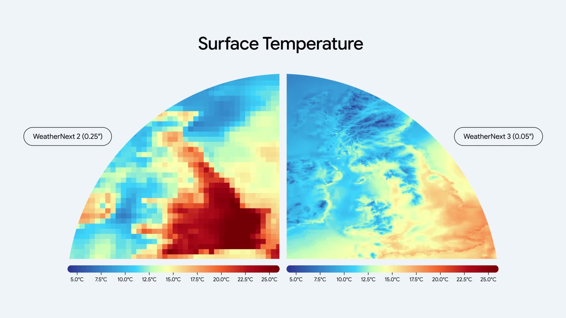
Google’s side-by-side temperature maps make a change in weather-model resolution easy to see. The WeatherNext 2 image uses a roughly 25-kilometer grid. The WeatherNext 3 image tightens that to roughly 5 kilometers.
The finer grid brings out shapes along the coastline that are difficult to distinguish in the coarser image. It is an immediately visible example of what higher spatial detail looks like.
What the comparison tells us
These are model visualizations from Google, not a live weather map. The resolution comparison applies to the temperature output shown.
More detailed output can make local patterns easier to inspect. It does not, by itself, establish that every prediction is correct: resolution and forecast accuracy answer different questions.
The larger picture
Google introduced WeatherNext 3 on September 3. The original announcement explains the model and its evaluation in more depth. This visual is a useful starting point for understanding the change without having to read a technical paper first.
Source published September 3, 2026. Coverage is based on the maker’s announcement and demonstration.